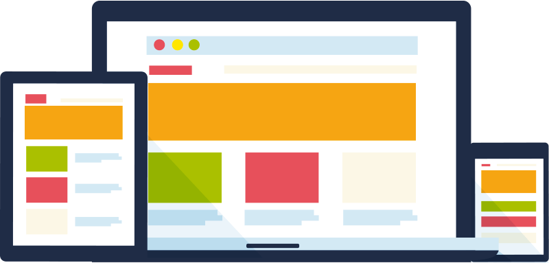
What Is Responsive Web Design?
Responsive Web Design, or RWDs, is a design tactic that responds to the user's behavior and actions - making it easier for webpages to rengder on any screen or device size.
RWD Tools
Wireframes
are basically storyboarding sketches to
showcase examples of what the site is going to look like.
Flexboxes
are a tool that give you control of how your
content will look on different size screens.
Importance of RWD
Visited a site that doesn't work well on any device?
By designing a program or function that is accessible on every
screen platform, you are able to access more users and deliver content in a
digestible way. Using HTML tools with RWD allows developers to create one
site that is functional for every type of user.